Headless Multi-Brand Design System for Gap and Athleta
A token-based design system serving two global retail brands from a single shared component library, built in three months including full Arabic localisation for the GCC market.
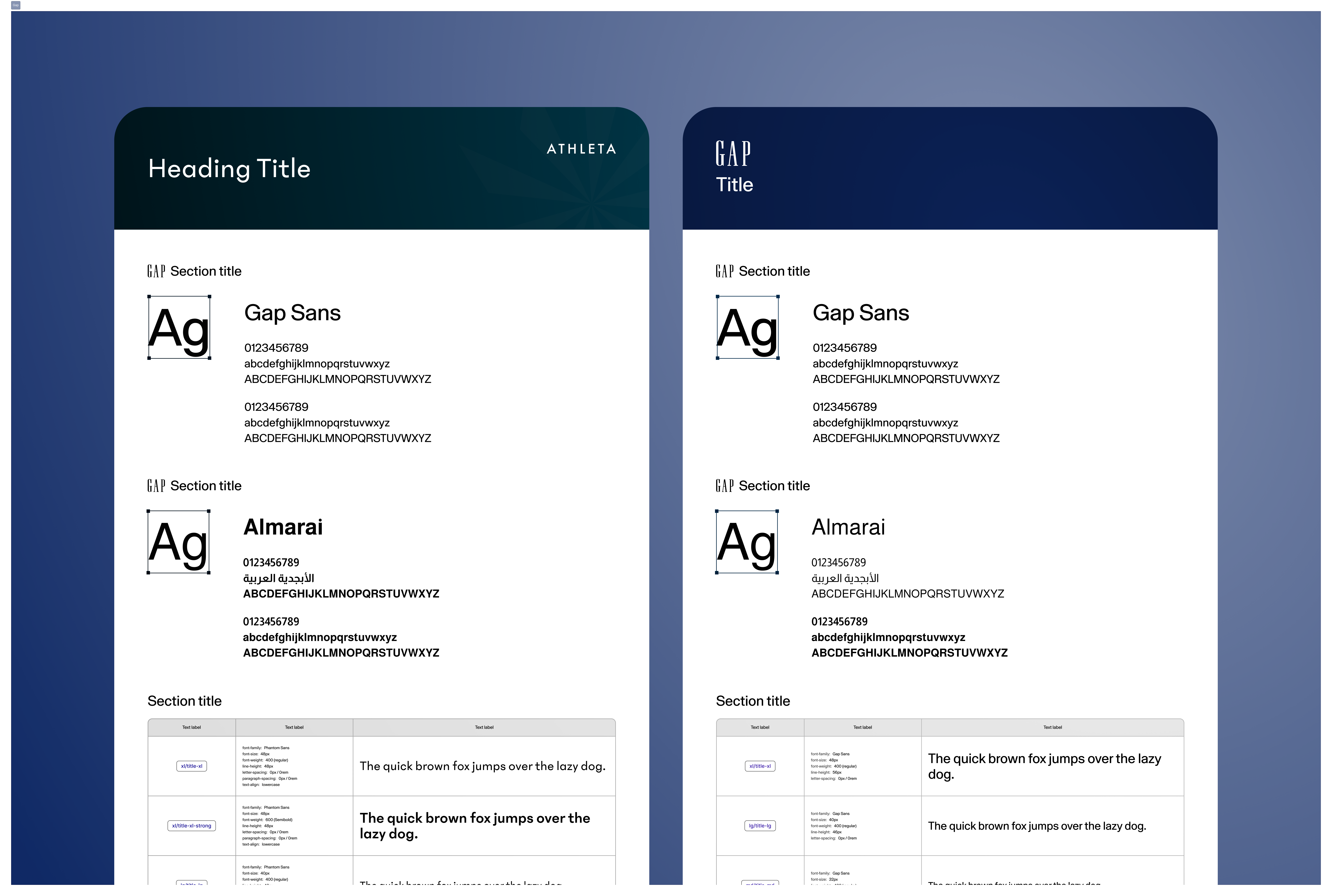
Three months. Two brands. Two languages.
We were tasked with delivering web and app experiences for Gap and Athleta in the GCC within three months, including Arabic RTL designs. Each brand had its own global design guidelines, but the majority of components and flows were functionally identical across both.
The challenge was structural: how do you build for two distinct brands without duplicating work, creating inconsistency, or sacrificing fidelity to each brand's identity? Without a system, the team would have been building the same things twice, introducing drift between implementations, and creating a QA nightmare across brands and languages.
The Problem Without a System
Understanding what the brands actually shared
Before building anything, we conducted a thorough UI and UX audit of all existing brand apps and platforms. The key finding was both obvious and actionable: most UI components were structurally identical across brands. They just needed different styling variables.
- Gap uses no bold fonts. Athleta uses bold prominently. The typographic system needed to accommodate both without creating separate component variants for every text element.
- Athleta uses rounded corners throughout. Gap uses zero border radius. The system needed brand-specific radius tokens at the component level.
- Both brands had specific spacing, hierarchy, and colour expectations that needed to be encoded as tokens rather than hardcoded into components.
Primitive tokens, brand tokens, components
The system was built on a three-layer token architecture: primitive base values defined first, then brand-specific semantic tokens built on top, then components that reference only the semantic layer, never the primitives directly.
This meant switching a component from Gap to Athleta was a single mode change, not a redesign.
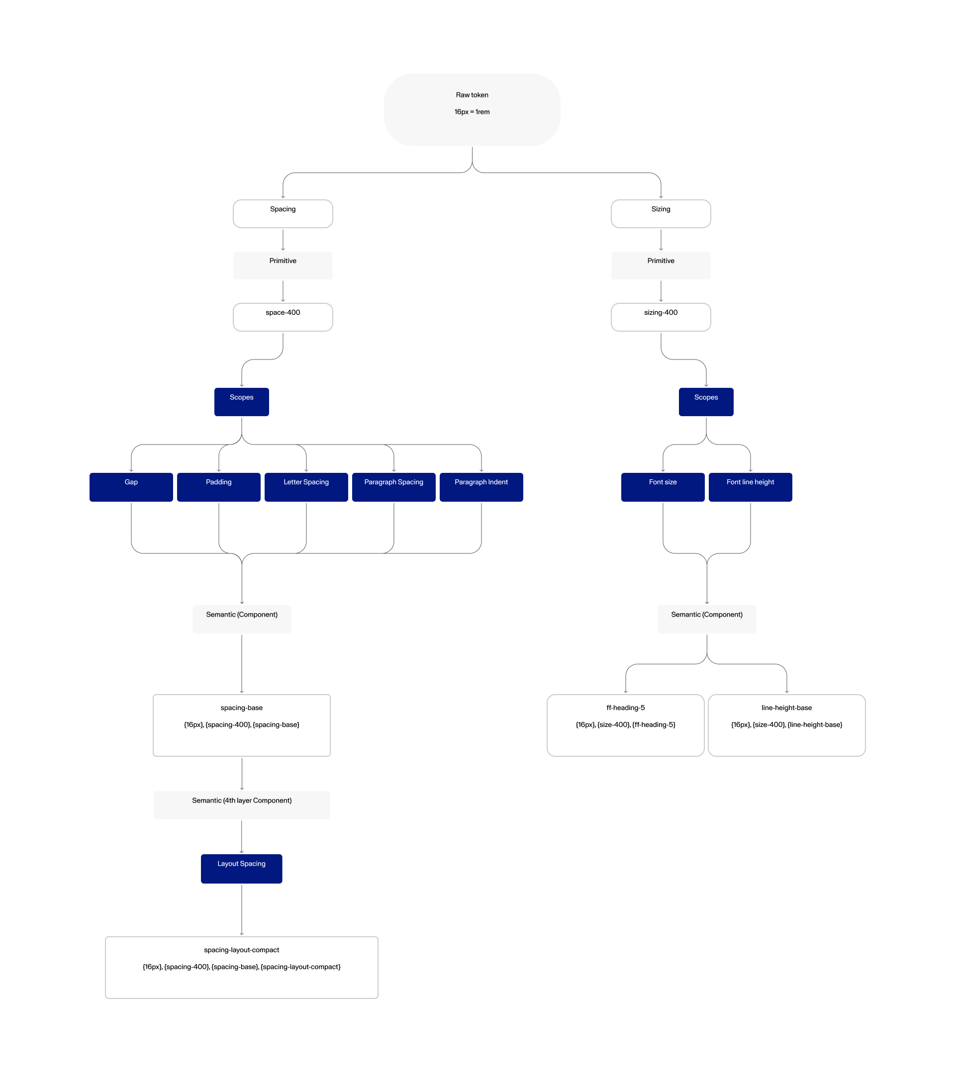
Three-layer token architecture: raw token to primitive to semantic, enabling brand switching via mode
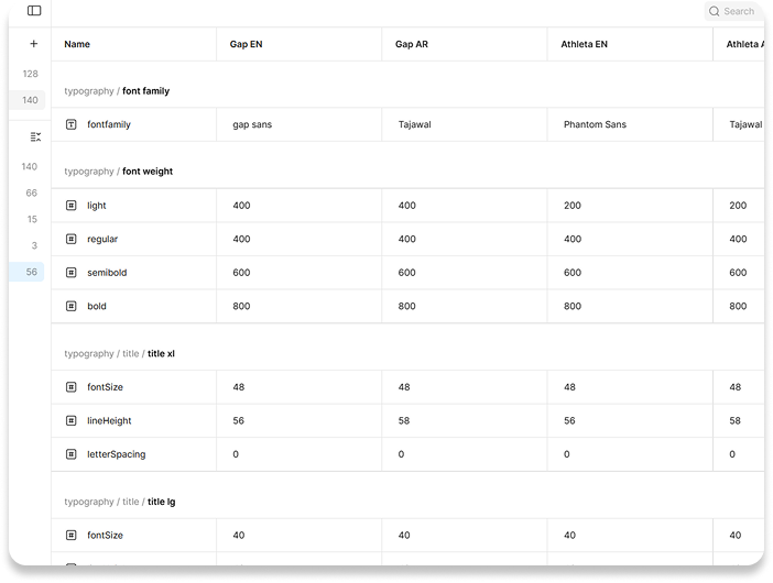
Typography token mapping across all four brand and language combinations
Where the real complexity lived
The button problem
The most visible expression of brand difference was the button. Gap uses a sharp rectangular shape with no border radius. Athleta uses a fully rounded pill. The same component needed to output both correctly based on a single mode switch, with no manual overrides required by designers or developers.
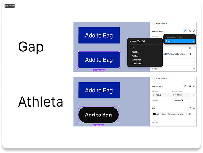
One component, two modes: Gap EN and Athleta EN produce entirely different button shapes from the same base
Colour tokens by brand
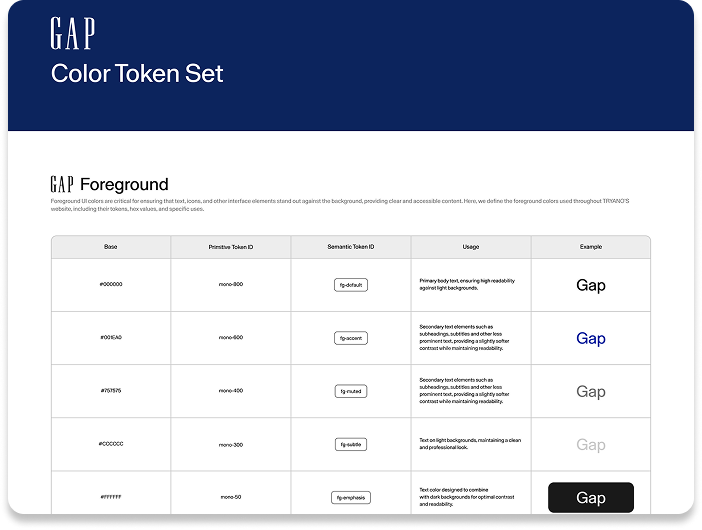
Gap colour tokens
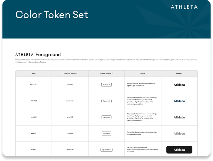
Athleta colour tokens
Applied to real checkout flows
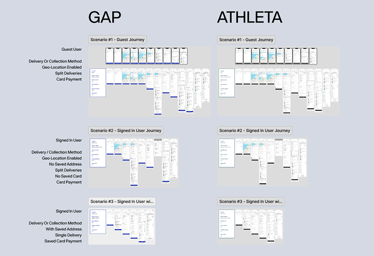
The same checkout component structure rendered in Gap and Athleta modes
Brand switching in action: applying design system modes across checkout flows
The system is only as good as its adoption
A design system that is not used is just overhead. We invested heavily in documentation that made the system genuinely useful for developers and PMs, not just designers:
- Component usage guidelines with do and don't examples for both brands
- Variable mapping documentation that made ticket writing easier for PMs
- Cross-brand override reference so developers could implement brand switching without needing to ask the design team each time
The result: developers noted clearer information in handoff, PMs praised the documentation for reducing back-and-forth, and QA errors, particularly around spacing and styling, dropped significantly.
Speed, consistency, and less rework
Outcomes
What I would evolve next
The biggest thing I would add in phase 2 is page-level master components. Right now the system handles atomic components well, but each designer still owns all pages for one brand. A better model would be one designer per page type who designs the universal template then applies brand modes, becoming the team's expert on that touchpoint rather than spreading thin across an entire brand.
I would also extend breakpoints to tablet and investigate dynamic layout adjustments for Arabic versus English. Right now RTL is handled correctly, but the layout opportunities specific to RTL reading patterns have not been fully explored.