Redesigning Checkout to Increase Conversion by 18%
A research-driven checkout redesign for GUESS, informed by Baymard ecommerce best practices and localised for the GCC market, including Arabic RTL design and regional BNPL payment options.
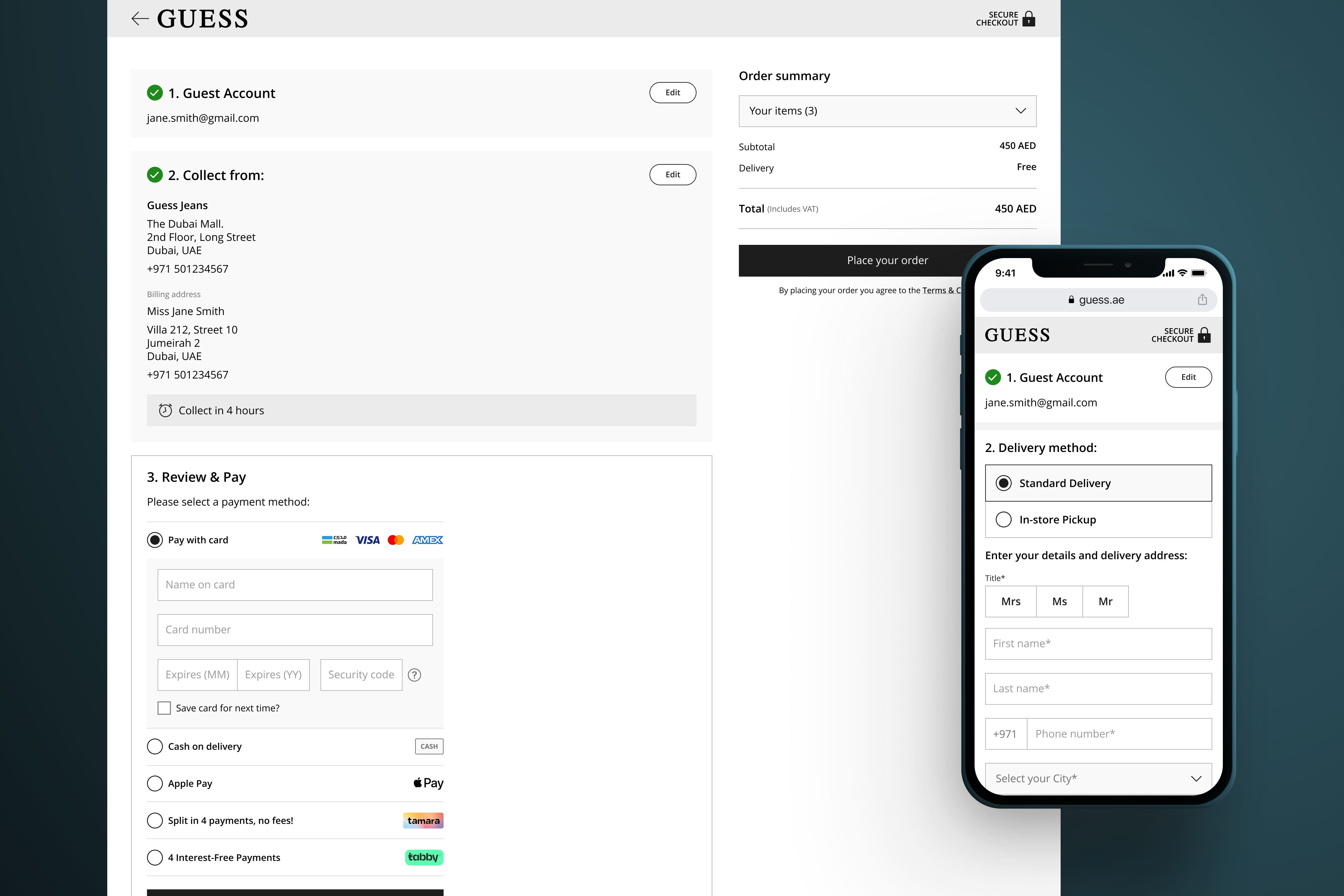
A checkout built for the wrong market
When we took over management of the GUESS ecommerce site, the checkout conversion rate was significantly below benchmarks. The problems were twofold: the checkout experience had fundamental usability issues, and it had not been adapted for the GCC market at all.
The GCC requires specific considerations that Western checkout flows do not account for. Buy-now-pay-later options like Tabby and Tamara are expected by shoppers, Arabic RTL layouts need careful design attention, and trust signals matter more in markets where online shopping is still maturing relative to in-store.
As a Baymard-certified designer, I applied findings from their ecommerce usability research programme to systematically identify and fix the highest-impact friction points across the entire checkout.
Starting Point
Four friction points killing conversion
A systematic audit of the existing checkout identified four core issues responsible for the majority of drop-off:
- Unclear form hierarchy fields were grouped poorly, creating cognitive overload at the most critical moment of the purchase journey.
- No GCC-localised payment options Tabby and Tamara, the dominant BNPL providers in the region, were absent, pushing shoppers to competitors.
- No trust or security signals reassurance messaging was missing throughout checkout, increasing anxiety at the payment step.
- No Arabic version a significant portion of GCC shoppers browse and buy in Arabic, and an English-only checkout created unnecessary friction.
Four targeted interventions
1. Simplified form structure
Reorganised checkout fields into a clearer visual hierarchy using section grouping and progress indicators. Reduced perceived complexity without removing required information cognitive load dropped significantly through better grouping and spacing.
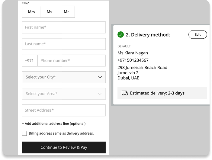
Reorganised form structure with clear section grouping and reduced cognitive load
2. Localised payment options
Introduced Tabby and Tamara alongside existing payment methods, presented with clear visual grouping. BNPL options were surfaced prominently, not buried, because in the GCC market instalment options are often a deciding factor at the payment step.
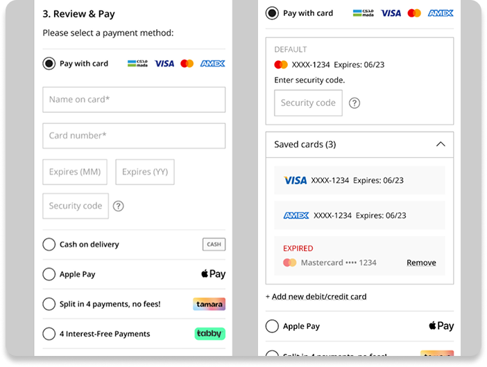
Localised payment step with Tabby and Tamara surfaced as primary options
3. Trust and reassurance messaging
Added security and payment reassurance signals at three key decision points: form entry, payment method selection, and order summary. Trust signals need to appear at the moment of anxiety, not just in the footer.
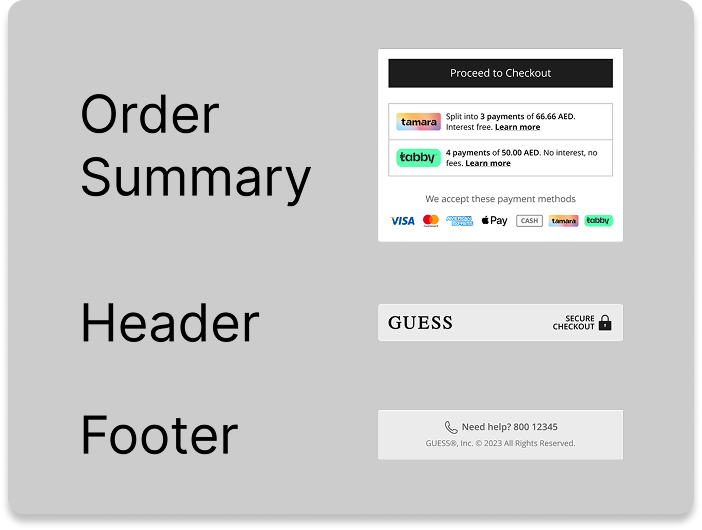
Reassurance messaging positioned at each moment of purchase anxiety
4. Arabic RTL design
Designed complete Arabic versions of the entire checkout flow. Not just text substitution, but genuine RTL layout consideration including icon mirroring, form field direction, and component alignment. Both versions were designed in parallel, not retrofitted from English.
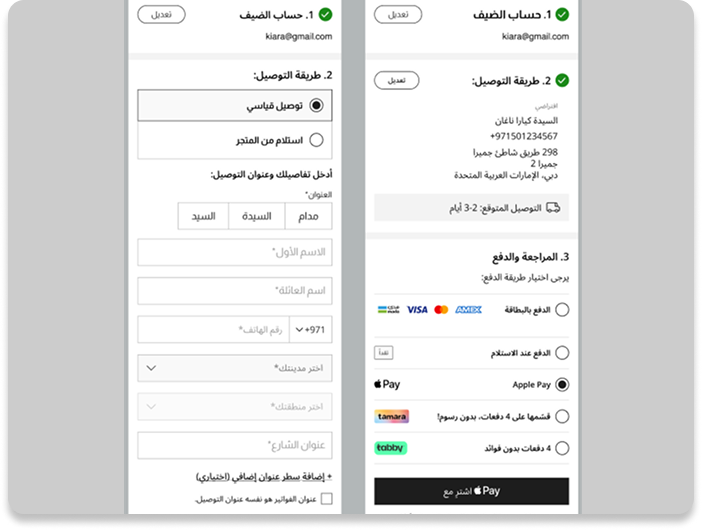
Complete Arabic RTL checkout designed in parallel, not retrofitted from English
Measurable results
Outcome
The redesign demonstrated that applying established ecommerce usability research combined with genuine regional localisation can directly move conversion metrics. Secondary research, when applied rigorously, is as valuable as primary testing, particularly when timelines are tight.
What I would do next
The 18% uplift is a strong result but a baseline, not a ceiling. I would want to run A/B tests comparing one-page, multi-step, and accordion checkout layouts to understand what performs best within the GCC context. Regional behaviour patterns differ from Western benchmarks in ways worth testing rather than assuming.
This project reinforced something I apply across all my work: the fastest path to shipping a good design is understanding operational constraints first. The Arabic version was possible in the same timeframe as English because we designed both simultaneously, not because we were faster, but because we planned correctly from the start.